Improve your presentations by eliminating rectangles
 One of the most common mistakes I see in creating PowerPoint (or Keynote) presentations deals with how images are presented in the slide. Sadly, the templates and wizards that come with these presentation programs often reinforce bad layouts. Many of these templates ask for a line to text for a title which sits above a rectangular image that has been inserted (see image 1). You’ve seen it before. Probably more times than you can count. So what’s wrong with it? The answer lies in how our eyes move through an image.
 The slide area itself presents a rectangle on the screen or wall. The edges of this rectangle “contain” the images and text you use to communicate your message. When you place another image inside this “container” its edges create barriers that our eyes run into. Rather than allowing the eye to move smoothly through the slide area, these hard edged rectangular images actually block eye movement. Hard vertical edges form lines that our eyes just don’t want to cross. We will certainly cross them, but not smoothly and easily.
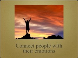
The second problem this layout creates is that often times images are presented too small to really help communicate. Because they are relegated to a small rectangle in the bottom portion of the slide they often lack punch and emotion. They seem more like afterthoughts than deliberate choices to communicate your message. In addition, in a larger auditorium this smaller image can be much harder to see clearly from the back of the room.
 Remove rectangles to allow smoother eye movement
So what do we do about it? The best approach to take in laying out your slides is to remove as many rectangles and hard vertical edges as possible. Often this can be done simply by making your image fill the entire slide. This allows the eye to move through the image itself, not just bump up against its edges. Your eye moves unobstructed through the image to the text you want them to focus on. This allows the image to help reinforce your message. Large images not only aide eye movement, they can convey more emotion and impact. As you can see from these two examples, the slides with the images full screen create more impact and tend to communicate a stronger message.
 You cannot always avoid adding rectangular images and boxes into your slides, but the fewer the better. Look for ways to eliminate these barriers and your slides will be more effective and easier on the eyes.


No comments:
Post a Comment