Tuesday, June 23, 2009

What about Twitter???

I have to admit when I first heard about Twitter I didn't get it. Twitter is a micro-blogging, social networking environment where people post short bits of information. These short posts must be no more than 140 keystrokes long and are called Tweets. Tweets are very much like your status message on Facebook (if you don't know what Facebook is check it out), but without the other frills. You can "follow" a particular person or group and stay up to date on their tweets as they are posted. One feature that attracts people is that you can follow and post tweets from your phone.
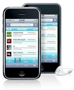
When I first checked it out a number of months ago I was quickly bored by the posts I read. It was mostly what people were doing at the moment (what TV show they were watching, what store they were shopping in, what they just ate for dinner and so on). It didn't take long for me to move on to other tools and write Twitter off as relatively useless. But I have to say I am changing my mind. No, I have not gained a new interest in what people had for dinner this evening, but I have found some folks to follow that are doing much, much more with this tool.

I fancy myself a shutterbug and so I started "following" the "tweets" from some professional photographers, whose work I admire. I noticed that for the most part their tweets contained links to blog posts, articles and images they had posted on the web. In essence, they were using their tweets to drive traffic to their main websites or blogs. I started learning by their posts. I was more aware of what was going on in the field of photography and I was starting to pay attention. I found out about seminars and events through tweets before they were even posted on the web! I was able to sign up for a seminar here in Denver before it was available to the general public because the photographer posted a link in his tweet. That is when the lightbulb went off for me. You see Twitter is about connecting people with information. Oh sure, there are thousands (maybe even hundreds of thousands) of people that are going to tweet that they just brushed their teeth, but that is the background noise we must get past. We can drive people to information and if we connect them to information they want (or need) they will keep "following."

So what does this mean for ministry?
One ministry example to look to is House to House, Heart to Heart. You may know HTH from the direct mail work they do for the church, but they are doing more than that. Their website hosts video lessons, sermon audio, articles, tracts and more. They are also using Twitter very well. Two or three times a day they "tweet" with links to content on their site. Sometimes they link to articles, other times it is a link to a sermon audio, but the point is they are driving traffic. They are "pushing" information out rather than simply posting the content and hoping people find out that it is there. Often times we build it (a building, a website, etc...) and hope people will come. But Jesus told us to GO and teach. The folks at House to House obviously understand that. They are going, and as they go they are teaching. Certainly I suggest that you check out their website, but I also suggest that you follow them on Twitter at @HousetoHouseHTH.

Imagine driving people to your podcast or sermon audio on your website. Think about letting people know that you just posted a great article to your blog on having stronger marriages. Maybe you simply tweet a verse of the day with a link back to your website for more. Tweet about a seminar you are doing with a link to your website with the details. Can you see the possibilities? Check out Twitter, but don't tell people what you had for dinner - give them food for their souls instead. These tools can help us reach thousands, what message are we sending them?

You can follow me on Twitter at @jmhite.


Monday, June 15, 2009

Don't let the technology drive the need...

Technology today is in some senses more affordable than ever. As prices come down we are often driven to implement technologies just because we can afford them now. So you can record your Sunday morning sermon on a video and post it to your website. That's great! But why do it? Most often the answer is simply, "because we can." We must think through these situations more thoroughly. What does the audience need to hear? Does your web audience need to hear a sermon designed to edify and motivate people who are already Christians? Or would they be better off hearing a lesson designed for them? We must think about the people we may reach...what do they need to hear? Are we giving them what they need or simply what we want to give them because we can? Too often we find a need to use technology rather than identify a need and then use technology to fill it.


Tuesday, June 09, 2009

Update: 1100 views on Slideshare in 5 months

About 5 months ago I wrote about Slideshare. This website allows you to post PowerPoint files to be viewed over the internet. As a test I posted the file below from a sermon I did using images from the Hubble Telescope interspersed with Bible verses. Well, without doing much promoting to drive traffic to it, it has been viewed 1100 times. In internet terms 1100 isn't reaching the millions of views that some viral YouTube videos get, but I got a Bible based message on creation to about 220 people each month for the last 5 months(avg). I'll take it. Think of what we could do if we tried to get the word out and promote these presentations. In addition to the online views, it has also been downloaded almost 500 times. Who knows where it has gone from there.

We need to look at new tools like Slideshare as opportunities to reach people. Each day, there are people seeking through these electronic tools. Will they find the Lord's church spreading the message of God?The Beauty of the Universe


Sunday, June 07, 2009

Make it big enough to be read easily!

Often times I am asked, “What is the best size font to use for my PowerPoint?” The answer is simple - one that is readable! That may seem a bit flippant, but it is the correct answer. You presentation should not be a eye test!! Bottom line is no matter how profound your lesson may be if they can’t read it from where they are sitting, it will detract from your message. Different auditoriums are different. What works in a small building may not work in a larger one. The size of the building, the size of the projected image, the colors being used on the slide, the font chosen, and even the brightness of the projectors all factor into how big your font should be. In other words, there is no universal answer to the question. TEST IT! Get into your auditorium, project your presentation, GO TO THE BACK OF THE ROOM and cycle through your slides. Are they readable? If they are - you found the right size font. If they are not, make them bigger. It is not really rocket science, it just takes some extra time.

Follow the “10-20-50” rule (actually it is more like a set of guidelines…)
There are some that suggest the “10-20-30” formula for your presentations. TEN slides, TWENTY minutes, THIRTY point font. While this may work is a small boardroom type presentation I can assure you that it won’t work in many larger auditorium settings. Thirty point font is too small in many situations and so I suggest a change to “10-20-50”. While again this concept should not be seen as a universal antidote to unreadable presentations, it can provide a starting guide from which to work.

10 SLIDES - Your presentation should not have more than a total of TEN slides to present your message. The idea here is that too many screen changes and transitions can become a distraction. Also, limiting yourself to ten total slides forces you to focus and simplify your message to its core elements. There certainly isn’t much room for rabbit chasing here.

20 MINUTES - Keep you presentation to twenty minutes when possible. Some suggest that after twenty minutes most people’s attention spans start to wane and they start tuning out. I have to say however that I have sat through presentation where I was tuning out far sooner than twenty minutes because the speaker didn’t seem interested or excited about his material. I have also sat in presentation that lasted well over and hour where I was riveted to the speaker because he was passionate and enthusiastic. Again, this should be seen as a guide, not a hard and fast rule.

50 POINT FONT - Keep your font size about 50 points at all times. This is where I personally think the “10-20-30” rule falls apart. Thirty point lettering seen from a distance is very hard to read. It also encourages the presenter to put too much text on each slide. Strive to limit the number of words you use on the slide (don’t just read full sentences off your slides) and make them as big as you functionally can. Now I know, I can hear you already - “there is no way I can fit everything I need to say on the slide using 50 point font.” My response is direct and to the point - you probably have too much text on your slide - but that is a topic for another post. In the mean time, simplify, simplify, simplify.

The 66% rule
There is another technique that I think can be very helpful in helping you select a more readable font size without leaving the comfort of your computer screen. (I actually like this better than to “10-20-50” rule.) After you have created your slides (or at least a few of them), switch to Slide Sorter View (in Keynote it is called Light Table). This view defaults to 66%. Scan through the slide in this mode and this size. If anything is difficult to read - it is too small!

Try these tips in your next presentation. Readability is a common problem and one the is curable with a little extra time and though. Remember, just because it looks good on your computer screen doesn’t mean much. You are sitting 24 inches away!! Test your presentation when you can in the environment where it is going to be viewed and make it readable. Remember, if they cannot read it it only serves as a distraction to your message.

Thursday, June 04, 2009

Improve your presentations by eliminating rectangles

One of the most common mistakes I see in creating PowerPoint (or Keynote) presentations deals with how images are presented in the slide. Sadly, the templates and wizards that come with these presentation programs often reinforce bad layouts. Many of these templates ask for a line to text for a title which sits above a rectangular image that has been inserted (see image 1). You’ve seen it before. Probably more times than you can count. So what’s wrong with it? The answer lies in how our eyes move through an image.

The slide area itself presents a rectangle on the screen or wall. The edges of this rectangle “contain” the images and text you use to communicate your message. When you place another image inside this “container” its edges create barriers that our eyes run into. Rather than allowing the eye to move smoothly through the slide area, these hard edged rectangular images actually block eye movement. Hard vertical edges form lines that our eyes just don’t want to cross. We will certainly cross them, but not smoothly and easily.

The second problem this layout creates is that often times images are presented too small to really help communicate. Because they are relegated to a small rectangle in the bottom portion of the slide they often lack punch and emotion. They seem more like afterthoughts than deliberate choices to communicate your message. In addition, in a larger auditorium this smaller image can be much harder to see clearly from the back of the room.

Remove rectangles to allow smoother eye movement
So what do we do about it? The best approach to take in laying out your slides is to remove as many rectangles and hard vertical edges as possible. Often this can be done simply by making your image fill the entire slide. This allows the eye to move through the image itself, not just bump up against its edges. Your eye moves unobstructed through the image to the text you want them to focus on. This allows the image to help reinforce your message. Large images not only aide eye movement, they can convey more emotion and impact. As you can see from these two examples, the slides with the images full screen create more impact and tend to communicate a stronger message.

You cannot always avoid adding rectangular images and boxes into your slides, but the fewer the better. Look for ways to eliminate these barriers and your slides will be more effective and easier on the eyes.